


 Now you can get the latest Java source bundled with each app update. Install the app from Google Play and go to Settings > Extras.
Build your first pro Android application with Eclipse
 Download
Keywords: AppCompat Fragment ActionBar ViewPager Navigation Drawer LoaderManager SQLiteDatabase CursorLoader SimpleCursorAdapter ContentProvider SQLiteOpenHelper ContentResolver ListFragment ListView GridView DialogFragment Volley Library RequestQueue ImageLoader NetworkImageView
Contents
- Overview
- Create a new Eclipse Android project
- Add Android Support library
- Android manifest
- Application theme
- Application class
- Splash screen
- Login screen
- Help screen
- Settings screen
- Navigation Drawer
- Main screen
- Dialog Fragment
- Content Provider
- Data model
- List Fragment
- Data Adapter
- Grid View
- View Pager
- Detail screen
- Volley Library
- What's next?
11. Navigation Drawer
 The navigation drawer is a panel that displays the app’s main navigation options on the left edge of the screen. It's implemented using DrawerLayout widget available in the v4 support library.
You can read more about its usage from Android design patterns site.
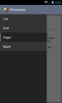
We borrowed code from the sample application provided here by developer.android.com and enhanced the look and feel as shown in the screenshot.First, edit activity_main.xml to include DrawerLayout as follows.
	<android.support.v4.widget.DrawerLayout
		xmlns:android="http://schemas.android.com/apk/res/android"
		android:id="@+id/drawer_layout"
		android:layout_width="match_parent"
		android:layout_height="match_parent">

		<!-- As the main content view, the view below consumes the entire
			 space available using match_parent in both dimensions. -->
		<FrameLayout
			android:id="@+id/content_frame"
			android:layout_width="match_parent"
			android:layout_height="match_parent" />

		<!-- android:layout_gravity="start" tells DrawerLayout to treat
			 this as a sliding drawer on the left side for left-to-right
			 languages and on the right side for right-to-left languages.
			 The drawer is given a fixed width in dp and extends the full height of
			 the container. A solid background is used for contrast
			 with the content view. -->
		<ListView
			android:id="@+id/left_drawer"
			android:layout_width="240dp"
			android:layout_height="match_parent"
			android:layout_gravity="start"
			android:choiceMode="singleChoice"
			android:divider="@null"
			android:dividerHeight="0dp"
			android:background="#222222"/>
	</android.support.v4.widget.DrawerLayout>
Next, modify MainActivity to set up the navigation drawer. We'll create a new class to simplify our code.
public class MainActivity extends DrawerActivity implements OnFragmentInteractionListener {

	private SharedPreferences prefs;

	@Override
	protected void onCreate(Bundle savedInstanceState) {
		super.onCreate(savedInstanceState);
//		setContentView(R.layout.activity_main);
As you can see MainActivity now inherits from DrawerActivity which contains all the boiler-plate code for displaying navigation drawer.
Next, create a Java class as follows.
	public class DrawerActivity extends ActionBarActivity {
		private DrawerLayout mDrawerLayout;
		private ListView mDrawerList;
		private ActionBarDrawerToggle mDrawerToggle;

		private CharSequence mDrawerTitle;
		private CharSequence mTitle;
		private String[] mNavigationTitles;

		@Override
		protected void onCreate(Bundle savedInstanceState) {
			super.onCreate(savedInstanceState);
			setContentView(R.layout.activity_main);

			mTitle = mDrawerTitle = getTitle();
			mNavigationTitles = getResources().getStringArray(R.array.nav_array);
			mDrawerLayout = (DrawerLayout) findViewById(R.id.drawer_layout);
			mDrawerList = (ListView) findViewById(R.id.left_drawer);

			// set a custom shadow that overlays the main content when the drawer opens
			mDrawerLayout.setDrawerShadow(R.drawable.drawer_shadow, GravityCompat.START);
			// set up the drawer's list view with items and click listener
			mDrawerList.setAdapter(new ArrayAdapter<String>(this,
					R.layout.drawer_list_item, mNavigationTitles));
			mDrawerList.setOnItemClickListener(new DrawerItemClickListener());

			// enable ActionBar app icon to behave as action to toggle nav drawer
			getSupportActionBar().setDisplayHomeAsUpEnabled(true);
			getSupportActionBar().setHomeButtonEnabled(true);

			// ActionBarDrawerToggle ties together the the proper interactions
			// between the sliding drawer and the action bar app icon
			mDrawerToggle = new ActionBarDrawerToggle(
					this,                  // host Activity
					mDrawerLayout,         // DrawerLayout object
					R.drawable.ic_drawer,  // nav drawer image to replace 'Up' caret
					R.string.drawer_open,  // "open drawer" description for accessibility
					R.string.drawer_close  // "close drawer" description for accessibility
					) {
				public void onDrawerClosed(View view) {
					getSupportActionBar().setTitle(mTitle);
					supportInvalidateOptionsMenu(); // creates call to onPrepareOptionsMenu()
				}

				public void onDrawerOpened(View drawerView) {
					getSupportActionBar().setTitle(mDrawerTitle);
					supportInvalidateOptionsMenu(); // creates call to onPrepareOptionsMenu()
				}
			};
			mDrawerLayout.setDrawerListener(mDrawerToggle);

			if (savedInstanceState == null) {
				selectItem(0);
			}
		}

		// Called whenever we call invalidateOptionsMenu()
		@Override
		public boolean onPrepareOptionsMenu(Menu menu) {
			// If the nav drawer is open, hide action items related to the content view
			boolean drawerOpen = mDrawerLayout.isDrawerOpen(mDrawerList);
			return !drawerOpen;
		}

		@Override
		public boolean onOptionsItemSelected(MenuItem item) {
			 // The action bar home/up action should open or close the drawer.
			 // ActionBarDrawerToggle will take care of this.
			if (mDrawerToggle.onOptionsItemSelected(item)) {
				return true;
			}
			return super.onOptionsItemSelected(item);
		}

		// The click listner for ListView in the navigation drawer
		private class DrawerItemClickListener implements ListView.OnItemClickListener {
			@Override
			public void onItemClick(AdapterView<?> parent, View view, int position, long id) {
				selectItem(position);
			}
		}

		private void selectItem(int position) {
			// update the main content by replacing fragments
			Fragment fragment = null;

			switch(position) {
			default:
				fragment = new ContentFragment();
				Bundle args = new Bundle();
				args.putInt(ContentFragment.ARG_POSITION, position);
				fragment.setArguments(args);
			}

			FragmentManager fragmentManager = getSupportFragmentManager();
			fragmentManager.beginTransaction().replace(R.id.content_frame, fragment).commit();

			// update selected item and title, then close the drawer
			mDrawerList.setItemChecked(position, true);
			setTitle(mNavigationTitles[position]);
			mDrawerLayout.closeDrawer(mDrawerList);
		}

		@Override
		public void setTitle(CharSequence title) {
			mTitle = title;
			getSupportActionBar().setTitle(mTitle);
		}

		/**
		 * When using the ActionBarDrawerToggle, you must call it during
		 * onPostCreate() and onConfigurationChanged()...
		 */

		@Override
		protected void onPostCreate(Bundle savedInstanceState) {
			super.onPostCreate(savedInstanceState);
			// Sync the toggle state after onRestoreInstanceState has occurred.
			mDrawerToggle.syncState();
		}

		@Override
		public void onConfigurationChanged(Configuration newConfig) {
			super.onConfigurationChanged(newConfig);
			// Pass any configuration change to the drawer toggls
			mDrawerToggle.onConfigurationChanged(newConfig);
		}

	}
First, create arrays.xml in res/values (if not already present) and define a new string array as follows.
    <string-array name="nav_array">
        <item>List</item>
        <item>Grid</item>
        <item>Pager</item>
        <item>Blank</item>
    </string-array>
There are few drawables (R.drawable.drawer_shadow, R.drawable.ic_drawer) and string resources (R.string.drawer_open, R.string.drawer_close) that you'll need to include to fix compilation errors. These resources are available in the samples project provided by Google.
We'll create a custom layout for drawer list item.
Here is the snippet for drawer_list_item.xml layout.
	<CheckedTextView xmlns:android="http://schemas.android.com/apk/res/android"
		android:id="@android:id/text1"
		android:layout_width="match_parent"
		android:layout_height="wrap_content"
		android:gravity="center_vertical"
		android:paddingLeft="16dp"
		android:paddingRight="16dp"
		android:textColor="#fff"
		android:background="@drawable/nav_item_selector"
		android:minHeight="?attr/listPreferredItemHeightSmall"/>
The background for list item is a selector drawable nav_item_selector.xml created inside res/drawable directory..
	<?xml version="1.0" encoding="utf-8"?>
	<selector xmlns:android="http://schemas.android.com/apk/res/android" >
		<item android:drawable="@drawable/background_nav_item_selected"
			android:state_checked="true" />
		<item android:drawable="@drawable/background_nav_item" />
	</selector>
We set separate drawable for normal state -> background_nav_item.xml
	<?xml version="1.0" encoding="utf-8"?>
	<layer-list xmlns:android="http://schemas.android.com/apk/res/android" >
		<item>
			<shape android:shape="rectangle">
				<solid android:color="#111111"/>
			</shape>
		</item>
		<item android:bottom="1dp">
			<shape android:shape="rectangle">
				<solid android:color="#444444"/>
			</shape>
		</item>
		<item android:top="1dp" android:bottom="1dp">
			<shape android:shape="rectangle">
				<solid android:color="#333333"/>
			</shape>
		</item>
	</layer-list>
and for checked state -> background_nav_item_selected.xml
	<?xml version="1.0" encoding="utf-8"?>
	<layer-list xmlns:android="http://schemas.android.com/apk/res/android" >
		<item android:top="2dp" android:bottom="2dp">
			<shape android:shape="rectangle">
				<solid android:color="@color/background"/>
			</shape>
		</item>
		<item android:left="5dp">
			<shape android:shape="rectangle">
				<solid android:color="#222222"/>
			</shape>
		</item>
	</layer-list>
Next, create a ContentFragment class through Eclipse wizard File > New > Other... and select Android Object and click Next. Select New Blank Fragment and click Next. Enter Fragment Name as ContentFragment and check Create layout XML and hit Finish.
	public class ContentFragment extends Fragment {

		public static final String ARG_POSITION = "position";

		public ContentFragment() {
			// Required empty public constructor
		}

		@Override
		public View onCreateView(LayoutInflater inflater, ViewGroup container, Bundle savedInstanceState) {
			// Inflate the layout for this fragment
			View rootView = inflater.inflate(R.layout.fragment_content, container, false);
			int i = getArguments().getInt(ARG_POSITION);
			return rootView;
		}

	}
Now you can run the app and see navigation drawer in action. However, each navigation item will open an empty fragment (ContentFragment). Later we'll modify the code to open different pages.
 Smart Pad
 Remind Me
 SMS Xp
 Forex Wiz
 Insta Chat
 Showcase
 Flappy Chick
 Daily Vocab