Android ActionBarCompat-Styled Sample
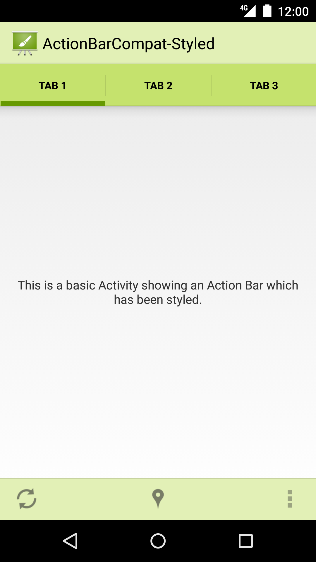
This sample shows you how to use ActionBarCompat with a customized theme. It utilizes a split action bar when running on a device with a narrow display, and shows three tabs.
Introduction
This sample shows how to style an ActionBar using the support library on devices running Android v2.1+ using a custom theme.
This Activity extends from AppCompatActivity, which provides all of the function necessary to display a compatible Action Bar on devices running Android v2.1+. A custom application theme and styles are defined in XML.
Assets have been generated using the 'Android Action Bar Style Generator'.
Pre-requisites
- Android SDK 26
- Android Build Tools v26.0.1
- Android Support Repository
Screenshots

Getting Started
This sample uses the Gradle build system. To build this project, use the "gradlew build" command or use "Import Project" in Android Studio.
Support
- Google+ Community: https://plus.google.com/communities/105153134372062985968
- Stack Overflow: http://stackoverflow.com/questions/tagged/android
If you've found an error in this sample, please file an issue: https://github.com/googlesamples/android-ActionBarCompat-Styled
Patches are encouraged, and may be submitted by forking this project and submitting a pull request through GitHub. Please see CONTRIBUTING.md for more details.
License
Copyright 2017 The Android Open Source Project, Inc.
Licensed to the Apache Software Foundation (ASF) under one or more contributor license agreements. See the NOTICE file distributed with this work for additional information regarding copyright ownership. The ASF licenses this file to you under the Apache License, Version 2.0 (the "License"); you may not use this file except in compliance with the License. You may obtain a copy of the License at
http://www.apache.org/licenses/LICENSE-2.0
Unless required by applicable law or agreed to in writing, software distributed under the License is distributed on an "AS IS" BASIS, WITHOUT WARRANTIES OR CONDITIONS OF ANY KIND, either express or implied. See the License for the specific language governing permissions and limitations under the License.
compile "com.android.support:support-v4:26.1.0"
compile "com.android.support:gridlayout-v7:26.1.0"
compile "com.android.support:cardview-v7:26.1.0"
compile "com.android.support:appcompat-v7:26.1.0"
compileSdkVersion 26
minSdkVersion 7
targetSdkVersion 26
package com.example.android.actionbarcompat.styled.tests
versionCode 1
versionName 1.0
package com.example.android.actionbarcompat.styled
versionCode 1
versionName 1.0
MainActivity
MainActivity
This sample shows you how to use ActionBarCompat with a customized theme. It utilizes a split action bar when running on a device with a narrow display, and show three tabs. This Activity extends from {@link AppCompatActivity}, which provides all of the function necessary to display a compatible Action Bar on devices running Android v2.1+. The interesting bits of this sample start in the theme files ('res/values/styles.xml' and 'res/values-v14</styles.xml'). * Many of the drawables used in this sample were generated with the 'Android Action Bar Style Generator': http://jgilfelt.github.io/android-actionbarstylegenerator